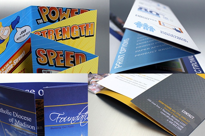
The best thing about being a graphic designer is developing something creative, fun and engaging. When designing for print, we strategize how content should flow through a piece to achieve the customer’s ultimate goal. It’s easy to get extravagant in the concept stage, but we usually need to keep budget in mind. Regardless of the budget allowance, we can always find a solution that fits everyone’s needs and still has that “wow” factor.
The benefits of being a graphic designer in a printing environment are the unlimited resources right at our fingertips, including our incredible bindery department who are always willing to talk through an idea. Together, we can figure out how to achieve an awesome outcome with simple straight scores. Often, time and money can be saved by making a piece machinable.
Note: A score is a preparation technique that allows the paper to fold with minimal cracking.
In addition to saving money on the production of a piece, you may also be able to save on postage. Depending on the size and specifications of the project, it could qualify to run at a lesser mail rate. Click here to get our quick guide to postage rates.
The following examples were created by our in-house creative team and are unique, effective and easy to produce.
Roll Fold
A roll fold is a traditional design where each panel rolls from one side, revealing a new spread each time a panel is turned. When working with a roll fold, each panel, aside from the covers, has to be progressively shorter (ranging from 1/32” to 1/16” less) to nest the panels. This is especially important when there are numerous panels and when using a thick paper stock.
You can easily turn a standard roll fold into something unique with a few small modifications. In this example, featured by FoldFactory, we shortened the panels by a half inch to simulate a tabbed brochure.
Glueless Pocket Poster Trifold
When budget is a concern, consider a glueless folder alternative. A typical pocket folder is created with glued tabs. Tabs require a die-cut, which increases the manufacturing and finishing costs.
This direct mail example features glueless pockets to enclose tip-on “garden markers.” This gives you the opportunity to strategically separate the content across 12 panels.
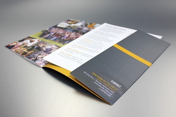
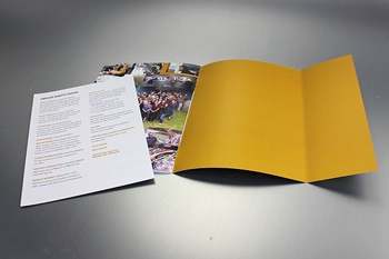
Another glueless pocket idea that’s more traditional is the folder shown below. The “pocket” on the inside back cover functions as a traditional pocket folder, but without glued tabs.
Gate Fold
A gate fold features two parallel folds to create 6 panels, which open from the center.
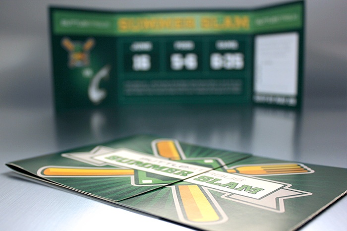
This double gate fold incorporates short panels on the inside of the gates, creating 4 additional panels (10 panels total).
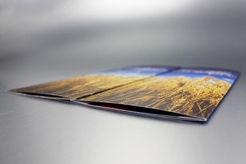
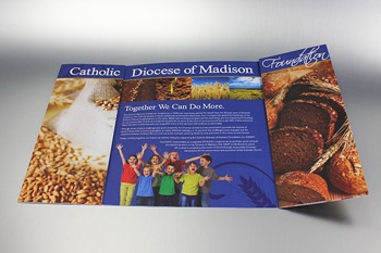
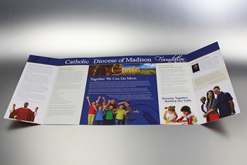

This brochure mailer is a closed gate fold. It opens to reveal a gate fold on the inside.
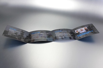
Vertical Trifold
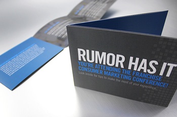
Trifolds typically open in a horizontal direction, but don’t rule out vertical orientation to give a piece a completely different appearance.
Note: This example uses glue to create a pocket, but similar to the glueless pockets mentioned above, there is no need for die-cut tabs.
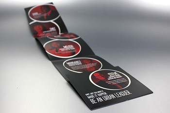
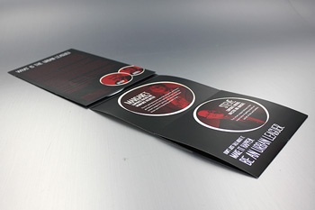
Accordion (Z-fold)
You may know the accordion fold as a Z-fold, which is typically equal panel widths that fold back and forth creating a “fan.” Like the other examples, these can also be modified.
This example features a perforated inner panel and a cover that wraps around the “fan,” resulting in a unique finished appearance. The shorter inner panels are also a modification (similar to the roll fold above).
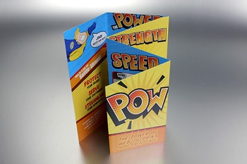
The next example has a 30-degree angle cut across multiple panels to create an interesting visual, and is referred to as a cascading accordion fold. This, too, can be done without a die.
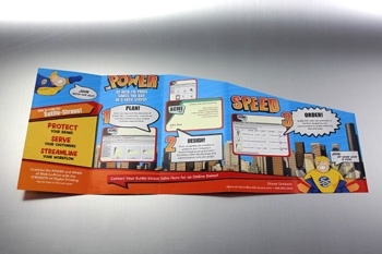
Broadside Fold
Sometimes mistaken as a French fold, this broadside fold example has 8 panels with a hidden flap.
If you’re bored with the standard trifold and need more impact or you fear you have too much content to organize in a simple brochure, refer back to these clever, easy ideas. We always recommend checking with your print provider when you’re in the concept stage to ensure they are able to achieve your design. While they are simply modifications to existing traditional folds, the creativity behind each is what makes them unique. If interested in applying any of these folds to your next piece, contact your sales rep.
What are some of your favorite machinable, budget-friendly folds? Let us know by posting a comment below!


