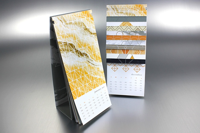
I recently undertook one of the most complex and comprehensive projects of my career thus far. It not only pushed me creatively, but it also pushed everyone involved to think outside of the box when it comes to layout, technique and capabilities. The end result is something I believe everyone is proud of and the process was an incredible learning experience.
Back Story
Each year Suttle-Straus mails out a holiday card to customers thanking them for their valued partnership. Previous years have included winter themes and giving thanks, presented in a variety of creative and unique ways. This year we decided to tackle a calendar, a concept the Creative team has wanted to pursue for a few years, with the creative task falling to me.
After attending the PaperSpecs Webinar, Calendar Magic: A Design for all Seasons, I was inspired by Champion International Corporation’s 2011 calendar layout. I started designing a concept that would leave a little piece of each month behind after you tore off the rest, so that at the end of the year you would be left with a small collection of paper samples. This layout would be perfect for showcasing different papers, ink, and printing techniques -- an idea that was great in theory, but soon presented a pile of challenges.
Major Hurdles
Paper Cost
To feature 12 unique papers (one for each month) would leave an impressive collection when the year was over, but the cost of buying that many papers was simply too high. Some solutions considered were to use one really nice paper for all months or to use only house stocks (which are primarily white). However, I had a clear vision of what the finished product would look like, and I wanted to stick to that as much as possible. I started rounding up unique papers that were collecting dust in inventory and tapped into a few unusual house stocks. With those savings, I was able to order a handful of new papers, which allowed me to print each month on a different sheet without sacrificing quality.
Discover paper selection tips in the blog article, "Achieving Your Desired Print Outcome: Paper Selection Considerations."
Too Many Press Plates
To run each month with a unique design on a different paper stock would usually mean new press plates, as well as set up time, for each one. Cost to do this can add up quickly. Instead of putting one month up multiple times on a sheet of paper I proposed putting all of the months up on one sheet, swapping out the papers, and tossing the months we didn’t need on each sheet. This may seem counterintuitive when trying to save money, but our run was short enough that this method meant only 2 sets of plates. Additionally, we had far less waste using this method because we only needed to dial in the color (make-ready) twice on press rather than 12 times. In the end, this solution saved us time and money.
Ink Choices
The hurdle here was that I was using crazy ink combinations on unfamiliar paper stocks on different presses. Without being able to run test sheets, I was unable to see what the final design would look like so I had to shoot in the dark on the colored paper options. The best way to sum it up was that some months, unfortunately, did not turn out as well as I had hoped. While a few inks absorbed into the paper or didn’t contrast enough, others turned out even better than I could have imagined! You never know until you try it, and I was able to walk away with a lot of lessons learned.
Binding Solution
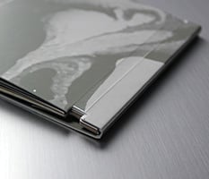
Options for binding range from cheap to very expensive, and finding the right one can be tricky. My challenge was to find a solution that was cheap but didn’t take away from the design. Staples, padding, rivets and sewing were all considered but dismissed for various impracticalities. I came up with the solution to bind all of the pages with a rubber band and was able to find the perfect one after tireless searching.
Looking for binding options? Download this free infographic for an overview of 14 common techniques.
Other things that needed to be considered
- Designing a calendar that didn’t have a large footprint on a person’s desk.
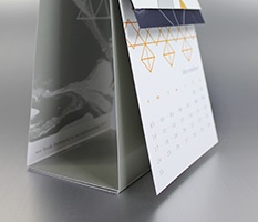
- Should it be free standing or hanging? Not everyone has walls to hang up a calendar so I felt strongly that the finished product need to be able to stand on it’s own. Which lead to…
- Creating an easel that was strong enough to hold the weight of the calendar without bowing and without tipping over. The paper stock and width of my base were carefully planned to address this.
- Designing months that were appealing, while avoiding clichés.
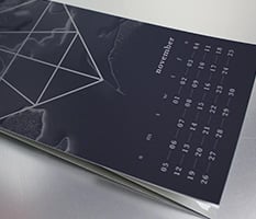
- Dealing with Pantone colors for coated vs uncoated on the same job (which does not happen often). You have to accept the fact that they will not be the same color in the end.
- Using two ink wells for white ink in order to get it as bright as I wanted, limiting my number of color options.
- Creating a color palette that was appealing after all of the months had been perfed off. This was particularly challenging due to the fact that my paper stock choices were dictated by cost, not design.
Even with all of these considerations, specifics, and details, this job went through production smoothly. That is not an easy feat based on the complexity of the entire job. I can attribute that to one simple thing: the importance of bringing everyone to the table. Designer, CSR, estimator, planner, pressman, die cutter, etc, worked together from the very beginning to make this project a success.
It would be nice for me to say that the calendar turned out perfect, but nothing ever is. I took a lot of chances with this design. I learned a lot about inks, presses, papers, binding, handwork, etc. I also learned some "what-not-to-dos" when it comes to printing. In the end, the risks I took paid off big time and I am left with a piece that I can be truly proud of.
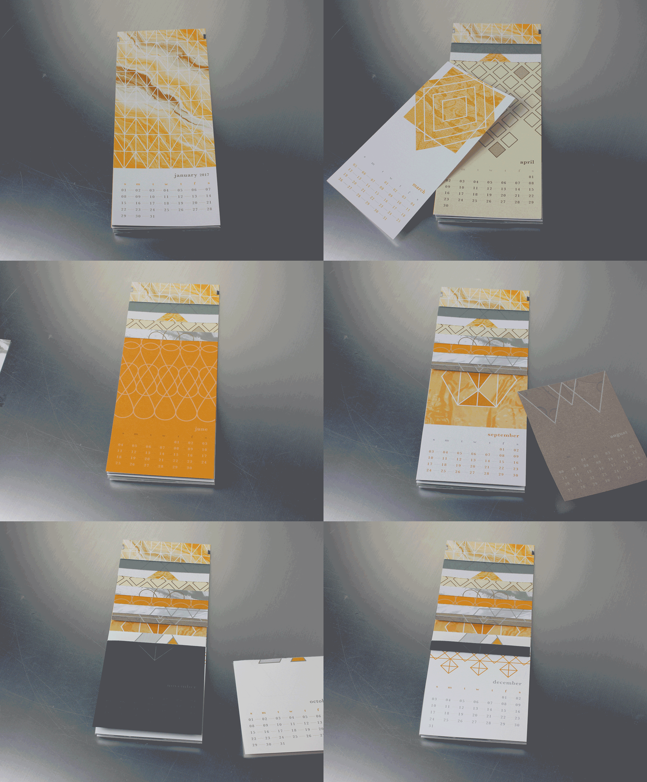
Do you need a calendar for your desk or are you interested in seeing this project for yourself? Request a copy of Suttle-Straus' 2017 calendar by emailing marketing@suttle-straus.com. Please let us know how many you'd like and your mailing address.


